TIL about margin convention in d3
TIL about margin conventions in d3. When you draw a visualization inside an SVG element, you tend to lose extreme datapoints. They tend to go beyond the SVG element, like this:
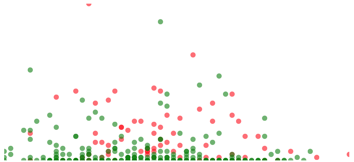
This happens because our circles (datapoints) are drawn with the origin as the value of cx or cy. So if the y-axis value happens to be 0, (x,0) becomes the origin point of our circle. Therefore, we lose half of that circle as the radius takes it down and out of svg. Same is true for cases when x value is maximum (the rightmost half-circle). A simple standard that is used in d3 community is to add margins around the visualization. Instead of drawing the graph directly inside the svg element, we define a g element withing the svg element and then draw our visualization (scatterplot or barplot) within that g element. Like so:
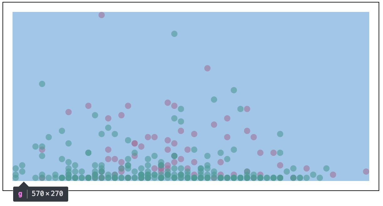
Notice how all the circles are completely inside the g element now. By defining the margins beforehand and setting up a g element based on those margins, allows us to focus on subsequent visualizations without ever worrying about margins.
I created a remixed version of the code from here. Two scatter plots side by side. The details of the dataset aren’t important for this TIL but if interested, one on the left is the survival results of breast cancer patients who underwent surgery while the one on right is the famous IRIS dataset.
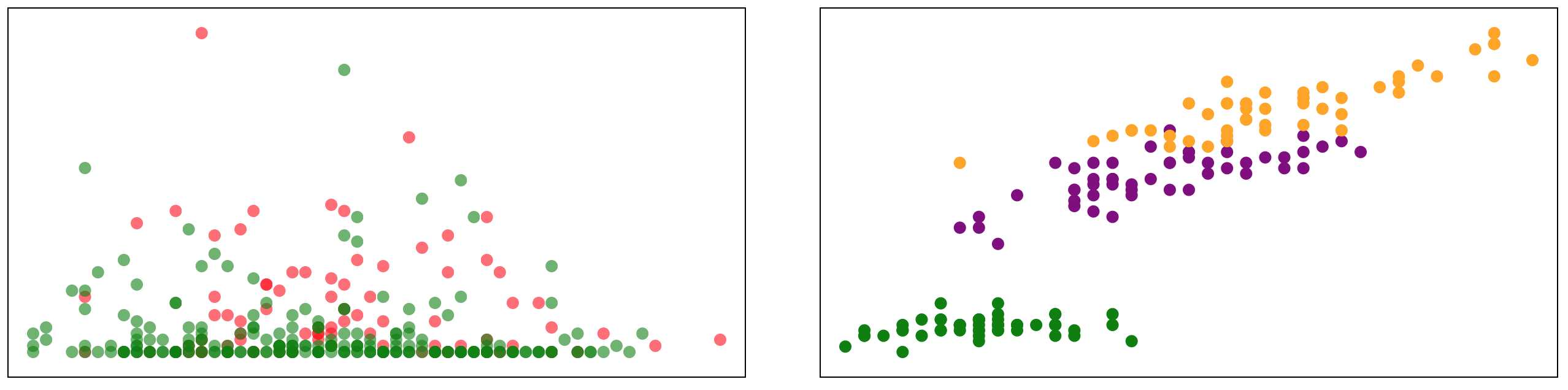
Code, datasets and above visualization can be found here (you will have to click “Open” at bottom right to see the full visualization). I encourage further remixing of my code by adding X and Y axis along with some ticks. Reading the code and peaking at the dataset column names will make it obvious what X and Y axis are supposed to mean for each scatterplot.